Featured case study · Client engagement

Center X Equine Therapy

A mobile-first, accessible website for a 501(c)(3) equine-therapy nonprofit — helping families understand the program, trust the team, join the waitlist, and support the mission. But the site is only the visible part: I delivered the entire technology stack end to end — domain and DNS, the inquiry and volunteer forms, the donation platform, hosting, and compliance posture. For an org with no IT team, I was the IT team.

Role: Product, design, build & full-stack delivery Nonprofit · healthcare-adjacent Full-stack delivery — no IT team required HIPAA-aware architecture
centerxequinetherapy.org

Live preview — the real, deployed site, embedded right here and currently in client review.

The challenge

A real mission with no real front door

The organization had a clear purpose — licensed therapists using the movement of the horse to help children and adults build balance, strength, and confidence — but its online presence didn’t carry it. There was a thin, basic existing site on a .com address with little for a visitor to do, and the .org they wanted to use was a parked “Launching Soon” page. No real way to join a waitlist, no integrated donations, no mobile-first or accessible build, and a small team with no developer, no IT staff, and no time to wrangle domains, forms, and donation tools. The job was to turn a trusted, in-person service into a website — and the working technology behind it — that earns that same trust in the first five seconds.

Before & after

From a basic page to a working front door

Same mission, same story — rebuilt as a fast, accessible site with real ways to act, on the org’s own .org domain.

Before The previous Center X website: a single hero image with a horse and child and minimal calls to action.
Previous site — centerxequinetherapy.com
After The new Center X website: a full hero with clear Donate and Join the Inquiry List actions and a structured layout.
New site — centerxequinetherapy.org
  • Real conversion paths — inquiry/waitlist, volunteer, and donate, instead of a single “Learn more.”
  • Integrated Givebutter donations — secure giving and a donor CRM, not just a link.
  • Mobile-first & accessible — built for a 375 px phone and screen readers.
  • Trust content — team, therapy horses, mission, plus location and directions.
  • Faster & owned — on a global CDN with automatic HTTPS, on the org’s own .org domain.

How I approached it

Two lenses on the same project

Good outcomes need both: the product thinking to build the right thing, and the program discipline to actually ship it.

Product lens

Build the right thing

Start with the user
Three audiences: families new to equine therapy, referral partners (PT/OT clinicians), and donors/sponsors. Each needs different proof before they act.
Name the unmet need
Newcomers don’t know what equine therapy is or whether it’s safe for their child. So the site leads with plain-language explanation, therapist credentials, and the horses’ calm temperament — trust content right where people decide to inquire.
Set a North Star
One guiding outcome: a family or partner can understand the program, trust the team, and join the inquiry list — on a phone, in under a minute. Every section earns its place against that.
Tie it to the business objective
For a nonprofit that means three conversions: inquiry-list sign-ups, donations, and volunteer interest — plus sponsor recognition that keeps supporters engaged.

Program lens

Actually ship it

Meeting notes & action items
The client meeting was captured in writing: model on The Shea Center, large hero, PayPal for launch, Instagram, two therapists and two horses, PT/OT now. Every preference became a tracked action item, not a memory.
A task list, end to end
Content collection, sitemap, prototype, build, donation flow, forms, accessibility, DNS — one list so nothing fell through the cracks between discovery and launch.
Dependencies, made explicit
The site depended on client-owned media (bios, photos), a donation-platform decision (PayPal vs Givebutter/Zeffy), waitlist tooling, and domain/hosting ownership on GoDaddy. Each was flagged early so it couldn’t silently block launch.
Critical path to launch
Content + donation flow + domain/DNS were the long poles. Everything else was built in parallel against a phased plan: discovery → content → design → prototype → build → QA → launch.

The discovery trail

Research before pixels

Before designing a single screen, I studied how the best therapeutic-riding nonprofits earn trust online — then turned the patterns into an information architecture.

Studied four reference nonprofits

The Shea Center, Ride Above Disability, Tara’s Chance, and SD Therapeutic Horsemanship — national polish and local peers, to see what families and donors expect.

Extracted the patterns that convert

Emotional hero + one mission line; three CTAs (Donate / Volunteer / Get started); named parent quotes; an accreditation/trust signal; a “what is equine therapy?” explainer for newcomers; meet-the-horses with sponsorship; and impact numbers.

Turned patterns into an information architecture

A first-launch sitemap — Home, Services (PT/OT), Meet the Team, Meet the Horses, Waitlist/Inquiry, Donate/Support, Sponsors, Contact — each section mapped to a user need and a conversion.

Prototyped, reviewed, and refined with the client

A polished homepage and core pages first, reviewed together, then refined — collaborative, not a hand-off.

Built, QA’d, and shipped

Implemented as fast, accessible pages wired to the services that run the org; checked on a 375 px phone; deployed to a live, HTTPS URL on Cloudflare Pages.

The full stack, delivered

Every layer, one accountable owner

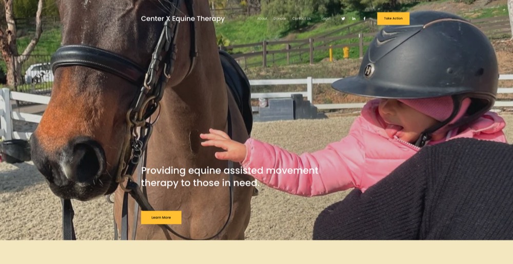
A website is only the part you can see. Most small and mid-size organizations don’t have an IT team to stand up a domain, wire forms to a spreadsheet, choose a donation platform, or keep email working when DNS changes. For Center X, I owned all of it — strategy through hosting — so the client never had to coordinate a registrar, a developer, a forms vendor, and a payments tool on their own.

  • Strategy & product — discovery, three target audiences, a North Star, and the information architecture/sitemap.
  • Design & build — hand-built, mobile-first (375 px), accessibility-minded pages: hero, programs, team, therapy horses, video, and location with directions.
  • Domain & DNS — GoDaddy registrar, DNS pointed to Cloudflare for free SSL/CDN, and email records preserved so mail kept working through the cutover.
  • Inquiry & waitlist forms — evaluated Google Forms, Airtable, Tally, and Fillout, then built the inquiry, volunteer, and contact flows, each routing to a tracked destination.
  • Donations — evaluated PayPal, Givebutter, Zeffy, and Donorbox, then shipped Givebutter (live) with a donor CRM and recurring giving.
  • Hosting & deploy — Cloudflare Pages with a global CDN, automatic HTTPS, and Git-based deploys with client preview links.
  • Compliance posture — HIPAA-aware by design: the public forms collect no protected health information, with a documented upgrade path for clinical intake.

Here’s what that meant tool by tool — the actual decisions behind each layer:

Givebutter (live) Cloudflare Pages GoDaddy (registrar) · DNS Forms: Fillout / Airtable Future: HIPAA intake (Jane App / IntakeQ / Jotform)

Inquiry & waitlist forms — non-clinical by design

After weighing Google Forms, Airtable, Tally, and Fillout (generous free tier, unlimited forms from one account), I built the Waitlist Inquiry, Volunteer Interest, and General Contact flows — each routing to a tracked destination (Sheets/Airtable) with category and source tags. Deliberately limited to basic contact, service interest, and a short inquiry, with explicit “please don’t submit medical details” copy.

A HIPAA-ready path — without slowing launch Future

Because the public forms collect no protected health information, the marketing and fundraising site shipped now. The form is a swappable module: when Center X needs real clinical intake, it moves to a BAA-signing vendor — Jane App for a PT/OT practice, IntakeQ/PracticeQ, or Jotform HIPAA — separate from the marketing site. (Healthcare judgment carried over from FDA-cleared medical devices at Dexcom.)

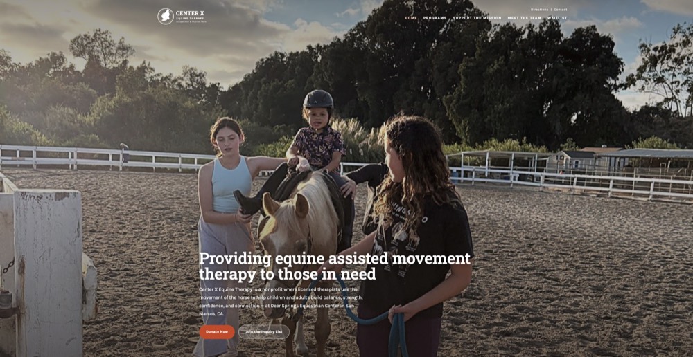
Donations & donor CRM — live

After comparing PayPal, Zeffy, and Donorbox, I shipped Givebutter — now live on the site. Genuinely free on the optional-tip model (tips on = $0 platform + $0 processing; tips off = a flat 3% + standard processing), with a free donor CRM, recurring giving, and campaign notifications. An Amazon Wishlist is an easy in-kind supplement.

Hosting & deploy — live

Deployed on Cloudflare Pages: free, a fast global CDN, automatic HTTPS, Git-based deploys with preview links for client review, and a password gate that was trivial to toggle before launch.

Domain, DNS & email — live

Kept the domain registered at GoDaddy (no transfer needed) and pointed DNS at Cloudflare for free DNS, SSL, and CDN — with email records preserved so mail kept working through the cutover. The site now resolves on its own .org with automatic HTTPS.

Data routing & follow-up

Every form lands somewhere with an owner — a shared Sheet or Airtable base per category (waitlist, volunteer, contact) with the tags built into the form structure, so no inquiry goes unanswered.

The outcome

A trustworthy front door — live and embeddable

  • Live on its own domain at centerxequinetherapy.org with automatic HTTPS — replacing a basic, hard-to-convert previous site.
  • Every conversion path working: inquiry/waitlist, volunteer interest, and live Givebutter donations with a donor CRM.
  • Mobile-first and accessible — built and checked on a 375 px phone, with trust content (therapist credentials, horses, mission, location and directions) built in.
  • One accountable owner for the whole stack — domain, DNS, forms, donations, hosting — so the client never had to wrangle vendors or developers.
  • So solid it’s embedded live on the Program Edge home page — the real, deployed site, not a mockup.

How we worked together matters as much as what shipped: embedded with the client, sharing context, capturing every decision, and making the calls together. A senior collaborator, not a vendor.

More work

Open-source tooling, AI products & writing

Smaller write-ups — each one shipped, public, and built to learn a stack or solve a real problem.

Open source · AI

ToolWitness

An Apache-2.0 framework that detects when AI agents skip tool calls or fabricate outputs — silent failures invisible to normal observability. Product lens: a category most teams can’t even name yet. Program lens: 310 tests, five framework adapters, and a live dashboard — shipped, not slideware.

View project
AI · Data

AI Market Report

An automated analysis agent covering 55+ assets with a 3-layer risk engine, built on Python, Claude, yfinance, and FRED. Product lens: make market risk readable by anyone, not just traders. Program lens: deployed daily via GitHub Actions with cross-source validation so a broken data feed can’t fail silently.

View project
Writing

AI & Building Blog

Field notes from real builds — how I work with AI agents, what context engineering actually takes, and the failures worth learning from. The thread: thinking out loud, in public, so the craft is visible — not just the polished result.

Read the blog

Have a project that needs both lenses?

Whether you need something shipped or a clear plan to get there, let’s talk about what an edge looks like for you.

Start a conversation